We look into the interesting combination of JavaScript and HTML that lets us make complex 3D pie charts that do more than just show data. There is a lot of information out there, therefore it’s very vital to be able to present data in a way that is clear, attractive, and interactive. A 3D pie chart may tell a more interesting tale with visuals when utilized correctly. This can help people comprehend proportional relationships right away and remember data insights better. This page talks about how web technologies may work together to make these dynamic visualizations come to life, turning boring facts into interesting visual narrative.
To make an interactive 3D pie chart, HTML must be used to build the framework and JavaScript must be used to handle the logic and display.
This HTML tag sets aside space and gets the environment ready for JavaScript to draw sophisticated images. HTML can also define things around the canvas, including legends, titles, or interactive controls like sliders or buttons that let users change or filter the data on the chart. The dynamic visualization is founded on a strong base of simplicity.
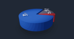
A good 3D pie chart does more than just show data; it also makes it easy for people to grasp the data and encourages them to interact with it.
Allowing people to engage with the chart in real time makes it much easier for them to understand. You can click on a slice to explore subcategories, hover over it to get pop-up details. All of these features make it more fun to look at data. This active participation helps users identify insights that would be missed in a static perspective, which makes the data more personal and relevant. JavaScript controls all of these interactions, which happen in real time based on what the user does.
Things to think about when developing: performance and choosing a library. To successfully use 3D pie charts, you need to make smart decisions about tools and optimization methods.
Picking the right charting library is an important first step. Three.js is a Socio-Technical Library that gives you a lot of control over 3D situations, but it also requires more specific knowledge. Chart.js and other simpler charting libraries might provide 3D plugins that make it easy to add basic 3D pie charts. Some things to think about are how complicated the visuals should be, how well the library should function, and how well the developer knows the library’s ecosystem.
We think that JavaScript and HTML work well together to make interesting 3D data visualizations at “Pie 3D Chart.” You can turn complicated datasets into 3D pie charts that are dynamic, interesting, and very instructive by knowing how they work, using clever interactivity, putting the user experience first, and making smart development choices. This method improves data storytelling, which helps people understand it better and makes your web apps really powerful in today’s environment, which is all about visuals.
Dive into the docs and start coding today!